As it has been difficult to pick a particular artist that caught my interest, I decided to go into a few popular artist websites to compare and contrast, to see what does and does not work for each of them.
David Wenzel
http://www.davidwenzel.com
I mentioned David Wenzel's work in a previous post, but I wanted to take another look at his site for its originality and ingenuity. One element that I will likely parody in my own website is the "enter" page that one must click on to enter locate Wenzel's information. Already Wenzel is forcing the viewer to engage with his page- which is a frequent element in his site. I love the visual imagery of his website- the art definitely takes precedent. The movement that he adds to the characters that decorate his pages are fun and interesting, but they do not distract from the information on the site. Wenzel's personality is amicably portrayed through the depiction of his website, which is something that I hope to emulate in my own website.
Julie Kagawa
http://juliekagawa.com/iron-fey
Julie Kagawa's author site is similarly visually engaging. The viewer is first presented with an overawing image that truly sets a tone for the website. She leaves a lot of the information to be accessed on the left with a nifty side bar and sub-categories that allow a viewer to sift through many layers of information. There are many different options provided in how a viewer can peruse a website-- this allows for people to travel it differently, depending on how they think. The meaty information is found later at the bottom after scrolling down-- I'm not sure if I'd want to stuff my own information so far in the back of the website.
Amy Mebberson
http://amymebberson.com
Amy Mebberson's approach is a little more direct. We are launched into her page, given first a few illustrations of her skill, and then information detailing exhibitions and social media connections. In my own site I hope to employ connections to other social media outlets so that my site is associated with my other websites. With less color composition in her background, the viewer can really focus in on her bright illustrations. While this works for her purpose, I feel like I would want my images to be larger and more integral to my website. I do like how she categorizes all of her art at the bottom of the page. This allows the viewer to find the type of art they are looking for with ease.
With these sites as my guide, I will hopefully be able to synthesize the elements that I like from each to make my own website work.
Sunday, April 12, 2015
Monday, April 6, 2015
"Identify Yourself" Webpage
This is a very fascinating website. Two columns of text make up the format, but these columns do not move proportionally to one another. The left column, under which the bold word "Identify" is comprised of various informative paragraphs regarding the internet- how it is used, how it has become intrinsically linked to human existence and identity. The column on the right, which bears the word "Yourself", is Krystal South's (the site's creator) personal reaction to all of these things. She links her personal experience to the greater nebulous understanding of the internet into concrete, personal anecdotes on how she herself has dealt with her coexistence with the internet.
In terms of formatting, the website is rather simple- the color scheme is direct (making the site look even a little outdated) and there are no distracting images or advertisements. Coupled with the fact that all a user can do is scroll down, these elements allow for easy navigation throughout the site. If anything, I found the font chosen to be a tad childish and difficult to read. It definitely gave the website a less professional air (it remains to be seen if this was the author's intent) and it took up a lot more room than a thinner, more legible font would need. Moreover, while perusing the article I found various grammatical mistakes, but they did not impede clear interpretation of the article's content.
One particular paragraph that I found to be interesting was "The Accidental Audience". It had a detailed analysis of how art is viewed and interpreted online. One could find a user's work of art competing alongside food pics on sites like Facebook, Tumblr and Youtube. The meaning of these works are constantly being reworked as they are reblogged and taken further and further out of their original context. South grapples with the concept of this diluted art form, ultimately claiming that all art (no matter what form it takes) has its purpose, and no effort is meaningless. She also brings up the "bastardization" of the word 'curation' that has taken place on social media sites. Series of pictures collaged on Pinterest are being called works of curation, which inherently devalues the hard work of of the curatorial work done in museums. In troubling the presence of art on the internet, South brings to light the new and unexpected challenges that artists face in the increasing digitization of our world.
Source: http://idyrself.com/
Monday, March 9, 2015
Vector Portrait in progress..

This is how things look without the image… A little wonky because the background is supposed to be black. Colors subject to change :)
Vector Artist: Tobias Gobel
Being a younger, more under the radar artist, it was difficult to find a lot of hard biographical facts about Tobias Gobel. What I did find, however, was an amazing illustration portfolio online with this quote:
"Tobias Göbel always drew, but he needed to take some detours, one of them social education, before he actually became an illustrator. But now he fully concentrates on being an illustrator and has invented a style full of pop and energy."
Many contemporary artists of the internet focus on their art, not personal information. Gobel is no exception. But his body of work is incredibly impressive; I couldn't pass up the chance to showcase some of his vector work:


There are many accepts to Gobel's art that make his work pop: the foremost being his dynamic, pop-arty compositions. Predominately, Gobel is combining the female form with nature, creating dynamic word play and using pattern to make appealing shapes to the human eye. A lot of his work revolves around symmetry and balance; many of his pieces could likely appear on a deck of playing cards. Each work carries a dynamic color composition, as he tends to stick to a primary color and work with it throughout his piece. Linear emphasis lends to a specifically graphic feeling to these vector drawings, and the eye is constantly drawn to the hair of the women portrayed in the work.
When searching for vector artists, Gobel really appealed to me. I think rather linearly about composition; I was drawn in particular to the innovative symmetry and color design of these drawings. His interplay with words and figure are particularly striking. Gobel's figures aren't necessarily the most important elements of his work- in fact, they are more used as means to achieve a larger meaning. Combined with beautiful nature, pattern, words, and figure, Gobel is effectively communicating human emotions, aesthetics and desires. If anything, I'd love to see more pieces combine both words and nature (as opposed to just one or the other)- I think the product would be very satisfying to see.
http://www.illustrationweb.us/artists/TobiasGoebel/view
Sunday, March 8, 2015

Tuesday, March 3, 2015


Wednesday, February 25, 2015
Artist Blog: Harold Cohen
Harold Cohen was born on May 1st, 1928, in England. Amidst a lifetime of creating art, he has also been a prolific professor, spending more than three decades teaching at University of California, San Diego. He is the noted creator of AARON, an artificial intelligence system that self generates incredible art pieces. This system he has created has attracted attention internationally. Now 86 years old, Cohen has since retired from UCSD and is now spending all of his time furthering the development of AARON.


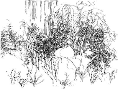
For me, one of the most striking qualities of Cohen's work is the incredible color scheme. While Cohen is mostly representing organic life in his work, the colors he uses to render the plants are almost radioactive. Many of them are not found in nature and they suspend the reality of the scene as something that takes place in the natural world. The line quality is also particularly interesting. It is very involved and complex, which lends itself to the aspect that it was not completely made by man's hand. Many aspects of Cohen's work- the line, color and composition, all refer back to the synthesized origins of the art. Cohen brings the dichotomy of nature and technology together in his work to provide a visually interesting interaction between these two very dissimilar aspects of life. Cohen is constantly reminding us of the huge role technology plays in how we see the world- even nature can be altered and warped with the hand of technological innovation.
Cohen's work, through the coding of his AARON system- provides for some very aesthetically pleasing artwork. The complimentary colors used in his chromatic pieces are easy on the eye and almost trick one into believing that the content could move at any instant. This vitality, which is encouraged by vigorous line use, engages the viewer in a dynamic way and allows the viewer's eye to roam freely around the work. The inclusion of the human figure in some works allows for a sense of relatability to pass between the work and the viewer- this makes for an interesting conversation on human vs nature vs technology. If anything, I would like to see a variation in subject matter, perhaps moving into larger landscape scenes, with more human subjects. However, Cohen has such a large body of work he may well have covered this.
Works Cited: http://www.aaronshome.com/aaron/index.html
Thursday, February 19, 2015
Testing Out AI…

Messed around with signatures and the paint brush… A departure from Photoshop but it's been good so far.
:)

Thursday, February 5, 2015


Wednesday, February 4, 2015
Artist Blog: David T. Wenzel


http://www.davidwenzel.com/hobbit.html
David Wenzel is a contemporary illustrator, working mostly in the areas of mythology, fantasy and folk lore. He is best known for adapting J.R.R. Tolkein's The Hobbit into beautiful illustrations. Wenzel has worked for many major publishing companies and has created art for a plethora of successful books, such as The Wizard's Tale and Kingdom of the Dwarves. Wenzel has the uncanny knack of imagining fantasy worlds in his mind and penning them down for all to see in great detail; he often creates creatures and characters that do not have a place in pre-existing lore. He lives in Connecticut with his wife and two sons, who are all talented and successful artists.
Much of David's body of work is inspired and contracted from previous literary writings. That being said, these canon works (such as scenes from The Hobbit, as shown above) are re-imagined and told in a refreshing new light. The scenes depicted so eloquently in Tolkein's words bloom with light and saturated colors in Wenzel's illustrations. Many of the scenes involve the figure and landscape in some way; a great sense of depth and grandness can be attributed to entire works and smaller panels within a storyboard. His use of warped perspective in a landscape further adds to the sense of scale in a work, allowing the reader to see more than would physically be possible. Suspending the world in this unreal way lends a fantastical vibe to the work. Just as Tolkien manages to weave an epic tale, we are able to see the epic scale of the characters' journey in Wenzel's paintings.
With the ultimate goal in mind of becoming an illustrator, this work is extremely appealing to me. The style is mature and treats the viewer as a competent reader who can grasp the complex themes and moments of Tolken's novel, but the work succeeds in also capturing a sense of vivid imagination and adventure. It is delightfully childlike in it's genuine zeal for the journey, but sophisticated in content and style. Composition and busy imagery bring these works to life, but they are organized enough that a viewer can comfortably follow through the images without trouble. You can tell Wenzel is a lover of fantasy, and even if that genre isn't your cup of tea, his renderings will tempt you to love it just as much as he does.
Tuesday, February 3, 2015
Photo Corrections
Before...

…and After.

I made many minor changes for an overall less washed out, more saturated photo.
And, another before...

...And after.

I worked a lot with color balances here, again no monumental changes but I think the picture looks better than before.
Monday, February 2, 2015

Wednesday, January 28, 2015


Subscribe to:
Posts (Atom)